Introduction to GeoPandas
Introduction
This is a post about using GeoPandas to perform some fun operations (that may have serious uses). GeoPandas (read about it here ) is an extension to the awesome Pandas system. GeoPandas extends the Pandas Series and DataFrame concepts, to define GeoSeries and GeoDataFrame objects (each entity has a column named 'geometry', which hold Shapely items).
So you get all the power of Pandas (especially the filtering and selection operations) and the Shapely geometric operations. Sometimes it is a little tricky to know which one to use. The examples below allow scope for same harmless chauvinism to illustrate the two systems.
The main driver for my interest in GeoPandas was the apparent inability of Basemap to be able to draw rotated maps. The east coast of Queensland is almost a straight line running about 30 degrees west of North, and I wanted to be to map it, just showing the coast line. These sorts of maps are sometimes call 'strip maps'.
There is a projection in Basemap (Oblique Mercator) which would be ideal, except that:
-
by default it rotates all maps to the North (defeating the whole purpose of my use of it)
-
turning off the rotation to North results in some weird mirror-image maps
I eventually gave up, and started to explore GeoPandas.
The GeoPandas "Hello World"
After all the imports have been sorted, the minimal GeoPandas program looks like
    world = gpd.read_file(gpd.datasets.get_path('naturalearth_lowres'))
    world.plot()
The first line reads a file that come packaged with the GeoPandas install, holding the shapes of the countries of the world. The second line instructs GeoPandas to plot it (under the hood there are calls to matplotlib).
This give a map like:
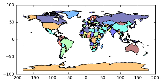
Not bad for two lines of code. A bit closer inspection shows that the limits of the Y axis don't stop at 90 North and 90 South. It is also a little unclear (at least to me), exactly what attribute hidden in the shapefile has been used for the color-coding.
Using matplotlib and Pandas services
The next example is a little deeper.
    fig, ax = plt.subplots()

    # set aspect to equal. This is done automatically
    # when using *geopandas* plot on it's own, but not when
    # working with pyplot directly.
    ax.set_aspect('equal')

    water = 'lightskyblue'
    earth = 'tan'

    ax.set_axis_bgcolor(water)

    ax.set_xlim([100, 160])
    ax.set_ylim([-50, 10])

    # remove Oz
    world[world['name']!='Australia'].plot(ax=ax, edgecolor='grey', facecolor=earth, linewidth=1, alpha=1)
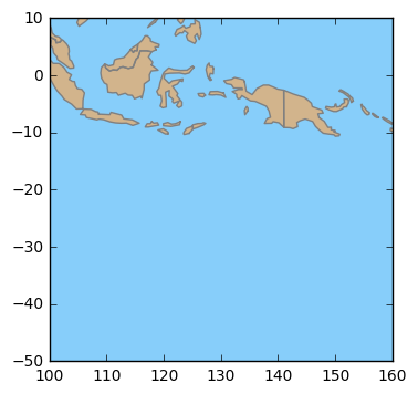
So here we interact with the matplotlib system, to set limits on the plot, background color (i.e. water), and aspect ratios.
We also use Pandas to filter out all rows in the world GeoDataFrame where the name attribute is 'Australia'. The end
result looks like:
Rotating Maps
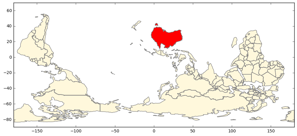
So now we want to flip the world, to put Australia near the top (after all, having North at the top is merely a social construct).
    fig, ax = plt.subplots()

    world = gpd.read_file(gpd.datasets.get_path('naturalearth_lowres'))

    # set aspect to equal. This is done automatically
    # when using *geopandas* plot on it's own, but not when
    # working with pyplot directly.
    ax.set_aspect('equal')

    # make the default color water
    water = 'lightskyblue'
    earth = 'cornsilk'
    ax.set_axis_bgcolor(water)

    # create a GeoSeries from the GeoDataFrame
    world2 = world[world['name']!='Antarctica']
    wgs = gpd.GeoSeries([g for  g in world2['geometry']])

    # rotate world
    wgs2 = wgs.rotate(180, origin = (0,0), use_radians=False)

    wgs2.plot(ax=ax, edgecolor='grey', facecolor=earth, linewidth=1, alpha=1)
Here, after all the usual matplotlib calls, we create a GeoSeries object from the world GeoDataFrame (with Antarctica removed to make the map look tidier).
Then we rotate the GeoSeries by 180, around the (0,0) center. Finally we call the plot() method of the GeoSeries.
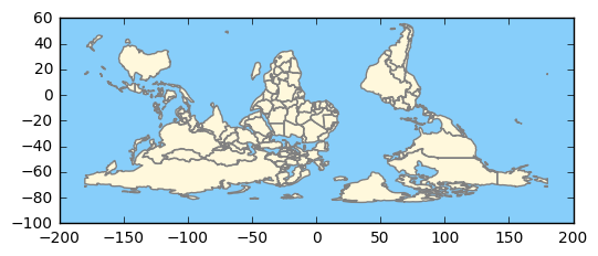
Note that in this case, we don't want the countries color-coded. The GeoSeries doesn't have all the attributes that the shapefile (and the GeoDataFrame) contains, but that's OK, because we don't need them.
However, if we wanted to highlight Australia, we could use the GeoPandas lines of code:
    # create a GeoSeries from the GeoDataFrame
    wgs = gpd.GeoSeries([g for  g in world['geometry']])

    # rotate the world
    wgs2 = wgs.rotate(180, origin = (0,0), use_radians=False)

    world['geometry'] = wgs2

    world[(world['name']!='Antarctica')&(world['name']!='Australia')].\
                 plot(ax=ax, edgecolor='grey', facecolor=earth, linewidth=1, alpha=1)

    world[world['name']=='Australia'].\
                 plot(ax=ax, edgecolor='grey', facecolor='red', linewidth=1, alpha=1)=1)
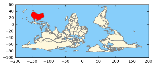
Here, we create a GeoSeries as before, rotate it as before, but this time we store it back into the GeoDataFrame. We them use Pandas
filtering to plot the rest of the world in a light color, and then Australia in a more vivid hue. There is a subtle point in here;
the indexes of the GeoSeries stored back into the GeoDataFrame, and the indexes of the GeoDataFrame must match for the
world['geometry'] = wgs2 assignment to work. If you have a view into a GeoDataFrame, you may have to do a copy(deep=True), and then a reset_index()
on the GeoDataFrame before you assign the GeoSeries back in. Examples are shown below.
Sliding Maps
As an extension of the map above, we now slide parts around to center Australia.
In the snippet below, we read the world shapes, perform some Pandas filtering, and create a new GeoDataFrame (world2) with a reset index.
    world = gpd.read_file(gpd.datasets.get_path('naturalearth_lowres'))
    world2 = world[(world.name != "Antarctica") & (world.name != "Fr. S. Antarctic Lands")].copy(deep=True)
    world2.reset_index(inplace=True)
Then we create a GeoSeries from the GeoDataFrame, and rotate it by 180 degrees, and store it back in the world2 object.
    # ------------- flip world

    # create a GeoSeries from the GeoDataFrame
    wgs = gpd.GeoSeries([g for  g in world2['geometry']])

    # rotate
    wgs2 = wgs.rotate(180, origin = (0,0), use_radians=False)
    # update the world geometry
    world2['geometry'] = wgs2
We create two clipping boxes, to allow the globe to be divided into two parts, that we will shift around. For each, we create a Polygon, then a GeoSeries, then a GeoDataFrame.
    # clip the world data to the clipper box
    polys1 = gpd.GeoSeries([Polygon([(-180,-90), (30,-90), (30,90), (-180,90)])])
    clipper1 = gpd.GeoDataFrame({'geometry': polys1, 'df1':[1]})
    polys2 = gpd.GeoSeries([Polygon([(30,-90), (180,-90), (180,90), (30,90)])])
    clipper2 = gpd.GeoDataFrame({'geometry': polys2, 'df1':[1]})
The GeoPandas overlay method is very powerful. Here we create two new GeoDataFrames for the two pieces of the world,
extract the two corresponding GeoSeries, shift each one to effectively rotate the globe, and then store them back into the GeoDataFrames.
    # clip part 1 and part 2
    pt1_df = gpd.overlay(clipper1, world2, how='intersection')
    pt2_df = gpd.overlay(clipper2, world2, how='intersection')


    # create a GeoSeries from each GeoDataFrame
    wgs1 = gpd.GeoSeries([g for  g in pt1_df['geometry']])
    wgs2 = gpd.GeoSeries([g for  g in pt2_df['geometry']])

    # left hand side wraps around to rhs
    gs1 = wgs1.translate(xoff=150)
    # move rhs leftwards
    gs2 = wgs2.translate(xoff=-210)

    pt1_df['geometry'] = gs1
    pt2_df['geometry'] = gs2
Now we use the Pandas ability to 'stack' DataFrames with the concat() method. Then, we do one plot in a subdued color, and another with a selection
(name = 'Australia') in red.
    both = pd.concat([pt1_df, pt2_df])
    both.plot(ax=ax,  edgecolor='grey', facecolor=earth, linewidth=1, alpha=1)
    both[both['name']=='Australia'].plot(ax=ax,  edgecolor='grey', facecolor='red', linewidth=1, alpha=1)

    plt.show()
Strip Maps
So, let us put all this together, and make a strip map of the Queensland east coast. We choose to plot some additional data on top of the strip map (as an example of how it can be used as an underlay). In this case we choose the cities database that comes from Natural Earth. We could do some filtering, but we just plot each and very city (well, populated place) that we have in our clipping box. It makes a nice example, of how Point data (as opposed to Polygon data) sometimes needs different treatment.
First up, we have our usual matplotlib boilerplate. Because we will be creating a non-standard projection (CRS) of our own, putting on the ticklabels would be misleading - so turn them off. If we were feeling energetic, we could manually plot the lines of latitude and longitude, but in this case it would be chart-junk.
    fig, ax = plt.subplots(figsize=(4, 21))

    #  turn off lat lon tick labels
    #  have a rotated axis doesn't make much sense
    ax.yaxis.set_ticks_position('none')
    ax.xaxis.set_ticks_position('none')
    ax.tick_params(labelbottom='off', labeltop='off', labelleft='off', labelright='off' ,\
                    bottom='off', top='off', left='off', right='off' )


    # define default colors
    water = 'lightskyblue'
    earth = 'cornsilk'
Because we are zoomed in to a 4 degree by 21 degree patch, the coarse coastline is a little too coarse. Thus we read the more detailed 1:50Million dataset downloaded from Natural Earth.
    # read coarse coastline data
    #world = gpd.read_file(gpd.datasets.get_path('naturalearth_lowres'))

    # activate below for more detailed coastline
    world = gpd.read_file('../data/shapefiles/ne_50m_land.shp')
Next we define a clipping box in latitude / longitude space, 4 degrees wide, 21 degrees high, with the lower left corner anchored at latitude 29 South, longitude 151 East. We then rotate the clipping box by 30 degrees (anti-clockwise). Finally we set the limits of the plot, based upon our clipping box.
    # angle of QLD Pacific cost line
    angle_d = 30
    angle = angle_d*(math.pi/180)

    # define bounding box for filtering operations
    lon0 = 151
    lat0 = -29

    lon_width = 4
    lat_height = 21


    # rotate the bounding box to match the coastline slope
    x0 = lon0
    y0 = lat0

    x1 = lon0 + math.cos(angle)*lon_width
    y1 = lat0 + math.sin(angle)*lon_width

    x2 = x1 - math.sin(angle)*lat_height
    y2 = y1 + math.cos(angle)*lat_height

    x3 = x2 - math.cos(angle)*lon_width
    y3 = y2 - math.sin(angle)*lon_width

    # set the Axes plot limits to the bounding box
    ax.set_xlim([lon0, lon0+lon_width])
    ax.set_ylim([lat0, lat0+lat_height])
We now define a Polygon, and the a GeoSeries, and then a GeoDataFrame, based on the clipping box. All this so we
can use the overlay( ... how='intersection' ) method, to get the coastline that appears in our clipping box.
We then rotate the GeoSeries for clipping box so that the box is vertical, and rotate the clipped coastline GeoSeries to match. We
then update the GeoDataFrames with the rotated geometric data, and plot both. The clipping box is given the water color
as a facecolor. This avoids having to download the Oceans database, and clipping that (which can be quite slow).
    # ------------------- plot coastlines ------------

    # clip the world data to the clipper box

    # box_poly will be used to clip points via shapely
    # polys1 will be used to crtae a GeoDataFrame clipper1 for polygon clipping
    box_poly = Polygon([(x0, y0), (x1, y1), (x2, y2), (x3, y3)])
    polys1 = gpd.GeoSeries([Polygon([(x0, y0), (x1, y1), (x2, y2), (x3, y3)])])
    clipper1 = gpd.GeoDataFrame({'geometry': polys1, 'df1':[1]})

    # clip cooastline
    coast_df = gpd.overlay(clipper1, world, how='intersection')

    # rotate coast
    coast_gs = gpd.GeoSeries([g for  g in coast_df['geometry']])
    coast_gs2 = coast_gs.rotate(-angle_d, origin = (x0,y0), use_radians=False)

    # rotate clipping box
    clipper1_gs = gpd.GeoSeries([g for  g in clipper1['geometry']])
    clipper1_gs2 = clipper1_gs.rotate(-angle_d, origin = (x0,y0), use_radians=False)

    # store back into GeoDataFrames
    coast_df['geometry'] = pd.Series([g for g in coast_gs2])
    clipper1['geometry'] = pd.Series([g for g in clipper1_gs2])


    # plot the two data frames, filling clipping box with water
    clipper1.plot(ax=ax, facecolor=water)
    coast_df.plot(ax=ax, edgecolor='grey', facecolor=earth, linewidth=1, alpha=1)
Now we read cities (well, populated places) data. The overlay method only seems to work for Polygon shapes,
so we create a logical mask, that selects all cities that are contained in our clipping box. We then make a deep copy
of this data into a new GeoDataFrame, and reset the index.
We the rotate the GeoSeries for the cities GeoDataFrame to match our coastline rotation, and store it back into the GeoDataFrame.
Then, for each city, we plot a marker, and then we get its x,y coordinates and name, and draw text.
Finally, we draw a North arrow, near the lower left corner (about the only place it is accurate, given the home-brew projection we have defined)
    # ------------------- plot cities ------------
    cities = gpd.read_file('../data/shapefiles/ne_10m_populated_places_simple.shp')

    # clip cities; use Shapely, as GeoPandas 'overlay() only works for polygons
    mask = [box_poly.contains(g) for g in cities['geometry']]
    my_cities = cities[mask].copy(deep=True)
    # necessary so can assign GeoSeries back to GeoDataFrame later
    my_cities.reset_index(inplace=True)

    # create GeoSeries from cities locations out of GeoDataFrame
    c_gs = gpd.GeoSeries([g for g in my_cities['geometry'] ])

    # rotate the GeoSeries
    c_gs2 = c_gs.rotate(-angle_d, origin = (x0,y0), use_radians=False)

    # update the 'geometry' column of the original GeoPandas data frame
    my_cities['geometry'] = pd.Series([g for g in c_gs2])

    # plot the GeoSeries
    my_cities.plot(ax=ax, marker='o', color='red', )

    for xy, n in zip(my_cities['geometry'], my_cities['name']):
        ax.text(xy.x, xy.y, s=n, fontsize=8)
    #end for

    # show northy arrow
    # need a font that support enough Unicode to draw up arrow. need space after Unicode to allow wide char to be drawm?
    ax.text(x0+0.5, y0+0.5,u'\u25B2 \nN ', ha='center', fontsize=30, family='Arial', rotation = -angle_d)

    plt.show()

Imports
Just for completeness, here are the imports from the Notebook that contains the code above (some are used only to support print-outs that define the environment for reproducibility purposes)
    # all imports should go here

    import pandas as pd
    import sys
    import os
    import subprocess
    import datetime
    import platform
    import datetime

    import matplotlib as mpl
    import matplotlib.pyplot as plt
    from mpl_toolkits.basemap import Basemap

    import geopandas as gpd
    import shapely
    from shapely.geometry import Polygon

    import numpy as np
    from matplotlib.collections import PatchCollection
    from descartes import PolygonPatch

    import math
The link to the Notebook that has all the code is coming soon.
Comment