GeoPanda and Data Display
Introduction
This is a short note to provide some examples of creating maps, with associated display of data.
Some of the complexity comes from the use of map projections. If we use Cartopy, then we get support for different map projections out-of-box.
Cartopy Example
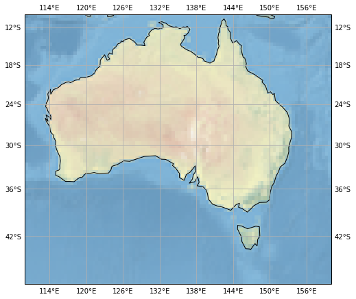
For example, if we run the code below, we can see that Cartopy has stretched the stock_img, and the gridlines to accomodate the Mercator projection.
fig = plt.figure(figsize=(8, 8))
ax = fig.add_subplot(1, 1, 1, projection=ccrs.Mercator())

# make the map global rather than have it zoom in to
# the extents of any plotted data
ax.set_extent([110, 160, -45, -10])

ax.stock_img()
ax.coastlines()

gl = ax.gridlines(draw_labels=True, crs=ccrs.PlateCarree() )
gl.xformatter = LONGITUDE_FORMATTER
gl.yformatter = LATITUDE_FORMATTER

plt.show()
GeoPandas Example
using PlateCarree
As an example, we are going to use the Geopandas naturalearth_lowres dataset, place a marker at the centre of each country, and draw a bounding box around Australia.
The code looks like:
fig = plt.figure(figsize=(12, 12))
ax = fig.add_subplot(1, 1, 1, projection=ccrs.PlateCarree())

path=gpd.datasets.get_path('naturalearth_lowres')

world = gpd.read_file(path)
print(world.crs)

box_oz = world[world['name']=='Australia'].copy().envelope

world.plot(ax=ax)
box_oz.plot(ax=ax, edgecolor='red', facecolor='none')
world.centroid.plot(ax=ax, color='red')

plt.show()
This gives us:
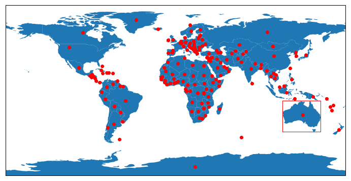
Note that the printout of the dataset Coordinate Reference System (CRS) gives us {'init': 'epsg:4326'}; i.e., it is our old friend PlateCarree (the projection we have chosen for the whole map.
Using Mollweide
If we wish to use a different projection for the map, we must use the Geopands to_crs() method, to convert the geometery attributes to the new projection coordinates.
The code looks like:
fig = plt.figure(figsize=(12, 12))

mol = ccrs.Mollweide()
ax = fig.add_subplot(1, 1, 1, projection=mol)

path=gpd.datasets.get_path('naturalearth_lowres')

world = gpd.read_file(path)
print(world.crs)

world_mol = world.to_crs(mol.proj4_init)

box_oz = world[world['name']=='Australia'].copy().envelope
box_oz_mol = box_oz.to_crs(mol.proj4_init)

world_mol.plot(ax=ax)
box_oz_mol.plot(ax=ax, edgecolor='red', facecolor='none',  )
world_mol.centroid.plot(ax=ax, color='red')

plt.show()
This gives us:
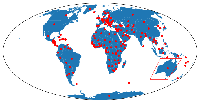
We can see that the centroids of the countries have been translated to the correct places, but sadly, the bounding box for Australia is wrong! This is because the box_oz_mol.plot() method we used, asks for straight lines in the Mollweide projection (which is not what we want).
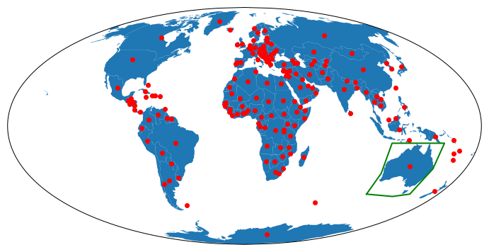
We can fix this by get the latitude, longitude pairs for the corners of the box, and asking Cartopy to draw great circle by use of the transform=ccrs.Geodetic() parameter to the plot() call.
The code looks like:
fig = plt.figure(figsize=(12, 12))

# specify a non-PlateCarree projection for map Axes
mol = ccrs.Mollweide()
ax = fig.add_subplot(1, 1, 1, projection=mol)

# read the datset we wish to display
path=gpd.datasets.get_path('naturalearth_lowres')

world = gpd.read_file(path)
print(world.crs)

# get the lat, lons of the Australia bounding box
box_oz = world[world['name']=='Australia'].copy().envelope
for t in box_oz.exterior:
    corners = list(t.coords)
    c_x = [xy[0] for xy in corners]
    c_y = [xy[1] for xy in corners]
#end for

# convert the dataset to the Projection we have chosen
world_mol = world.to_crs(mol.proj4_init)

# plot the dataset, using GeoPandas plot command
world_mol.plot(ax=ax)

# Plot the bounding box, asking Matplotlib / Cartopy to use Great Circles for the bounding box lines
plt.plot(c_x, c_y,  linewidth=2, transform=ccrs.Geodetic() , color='green')
world_mol.centroid.plot(ax=ax, color='red')

plt.show()
This gives us the following map, where indeed the green bounding box just touches Australia.
Markers with Meaning
Default Projection
Now we move on to making the markers carry more information than just their location.
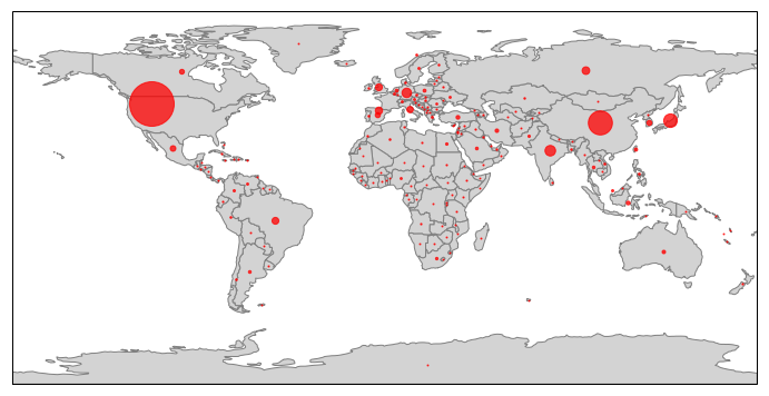
Suppose we want to display GDP for each country.
The code below will achieve this is shown below.
One caveat: the whole concept of encoding a value into a circle is a little contentious - should the radius or the area be proportional to the value? I have chosen to encode the radius. I have used the GeoPandas iterrows() method to access each row (country) of the GeoPandas dataframe one by one, zipped up with the geometric centroid of each country.
fig = plt.figure(figsize=(12, 12))
ax = fig.add_subplot(1, 1, 1, projection=ccrs.PlateCarree())

path=gpd.datasets.get_path('naturalearth_lowres')

world = gpd.read_file(path)
gdp_max = world['gdp_md_est'].max()
gdp_min = world['gdp_md_est'].min()

world.plot(ax=ax, facecolor='lightgrey', edgecolor='grey', )

max_size = 40
min_size = 1

#world.centroid.plot(ax=ax, color='red')
for (idx, country), cd in zip(world.iterrows(), world.centroid):

    gdp = country['gdp_md_est']
    plt.plot(cd.xy[0], cd.xy[1],
             marker='o',
             color='red',
             markersize=min_size+(max_size-min_size)*(gdp/gdp_max),
             transform=ccrs.Geodetic(),
            alpha=0.75,
            )

#end for
plt.show()
This gives us:
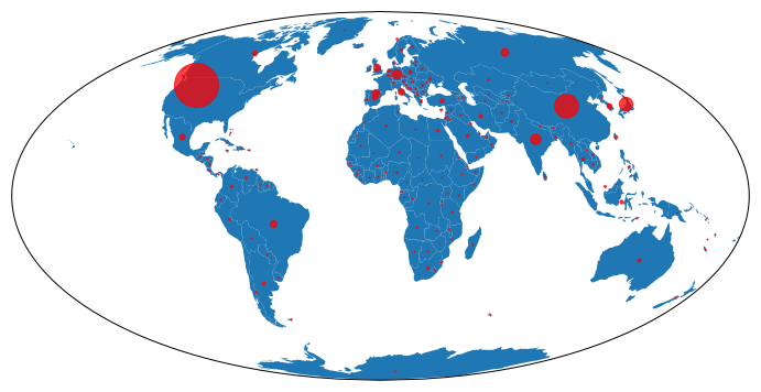
Mollweide Projection
If we want to display the same data, but on the Mollweide Projection, then the code looks very similar. We read the dataset, and convert the geometery to coordinates in the desired projection by world_mol = world.to_crs(mol.proj4_init).
We then use GeoPandas to plot the map outlines by world_mol.plot(ax=ax).
We then plot the markers via Matplotlib / Cartopy, getting the original lat/lon values, and asking Cartopy to transform these from a Geodetic projection, to the current map projection.
# set range of marker size
max_size = 40
min_size = 1
for (idx, country), cd in zip(world.iterrows(), world.centroid):
    gdp = country['gdp_md_est']
    plt.plot(cd.xy[0], cd.xy[1],
             marker='o',
             color='red',
             markersize=min_size+(max_size-min_size)*(gdp/gdp_max),
             transform=ccrs.Geodetic(),
            alpha=0.75,
            )

#end for
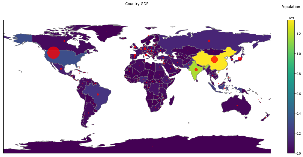
GeoPandas Continuous Shading and Discrete Markers
GeoPandas comes with capability to display data in spatial context, by the color of the polygons it plots. We can combine this with our markers, as below:
First, we define our figure, and get a Cartopy-aware Axes object.
fig = plt.figure(figsize=(20, 20))
ax = fig.add_subplot(1, 1, 1, projection=ccrs.PlateCarree())

# set aspect to equal. This is done automatically
# when using *geopandas* plot on it's own, but not when
# working with pyplot directly.
ax.set_aspect('equal')
Then we load our dataset.
path=gpd.datasets.get_path('naturalearth_lowres')

world = gpd.read_file(path)
gdp_max = world['gdp_md_est'].max()
gdp_min = world['gdp_md_est'].min()
Then we tell GeoPandas to plot the country polygons, coloring each one according to the estimated population (the pop_est column of our dataframe).
p = world.plot(ax=ax, facecolor='lightgrey', edgecolor='grey', column='pop_est',
           legend=True,
          )
Then we define our marker sizes, and for each row (country) in our dataframe, get the longtitude / latitude of the geometric centroid, and get the GDP (estimated). We then place a marker at that position, sized according to the GDP value.
max_size = 40
min_size = 1


for (idx, country), cd in zip(world.iterrows(), world.centroid):

    gdp = country['gdp_md_est']
    plt.plot(cd.xy[0], cd.xy[1],
             marker='o',
             color='red',
             markersize=min_size+(max_size-min_size)*(gdp/gdp_max),
             transform=ccrs.Geodetic(),
            alpha=0.75,
            )

#end for
Now for some hackery: GeoPandas defaults to a color bar that runs from near the bottom of the figure to near the top, embedded in its own Axes object. Because we have a map projection that is twice as wide as high (360 degrees vs 180 degrees),
and because we have asked for a square figure fig = plt.figure(figsize=(20, 20))
this gives us whitespace above and below the map. The color bar is out of proportion.
So we get the Axes objects for map and legend (colorbar), and force the color bar Axes to be the same height as the map Axes.
Then we set a title in each axis, and show the result.
map_ax = fig.axes[0]
leg_ax = fig.axes[1]

map_box = map_ax.get_position()
leg_box = leg_ax.get_position()

leg_ax.set_position([leg_box.x0, map_box.y0, leg_box.width, map_box.height])

leg_ax.set_title('Population', pad=40)
map_ax.set_title('Country GDP', pad=50)

plt.show()
This gives us:
Imports
Just for completeness, here are the imports from the Notebook that contains the code above (some are used only to support print-outs that define the environment for reproducibility purposes)
# all imports should go here

import pandas as pd
import sys
import os
import subprocess
import datetime
import platform
import datetime

import matplotlib.pyplot as plt

import cartopy.crs as ccrs
from cartopy.mpl.gridliner import LONGITUDE_FORMATTER, LATITUDE_FORMATTER

import geopandas as gpd
from shapely.geometry import Polygon
import numpy as np
The link to the Notebook that has all the code is coming soon.
Comment