LANDSAT Image Processing
LANDSAT Image Mapping
Introduction
So I thought I would document the process of incorprating LANDSAT images into maps. I have already covered the use of MODIS images in maps, but LANDSAT offers images with a finer resolution, even if they are not almost-real-time.
This was mostly prompted by the fact that LANDSAT images can now be downloaded from AWS. Read about it here https://aws.amazon.com/public-datasets/landsat/.
The AWS data repository also comes with an index that allows you to select images with a given cloud cover, covering a given lat/lon. I must admit that I 'cheated',
and downloaded the .CSV file, and read it with Excel to do the filtering to get the candidate images. Given the
index .CSV file is almost 200 Megabytes, perhaps I should have used pandas instead, but hey, path of least resistence.
So I picked a couple of images to work with, downloaded the files from AWS, and elected to work with Cartopy.
GeoTIFF Images
The LANDSAT images are what is called GeoTIFF format; basically TIFF images, with additional metadata that describe the spatial contxet of the image. In this case, the metadata includes:
-
how big each pixel is in the X (longitude) direction
-
how big each pixel is in the Y (latitude) direction
-
the projection used to map from lat/lon values to X,Y pixels
-
the origin (in image projection units) of the top left corner
Each image is generated from a single LANDSAT band; our first image will be of Band 5, recording the near Infrared, which is strongly reflected by vegetation.
Displaying the GeoTIFF Metadata
The two libraries you will need are gdal, and osr. GDAL stands for Geospatial Data Abstraction Library, and OSR stands for OGR Spatial Reference, where OGR
stands for Open Source Geospatial.
    # support for TIFF input
    import gdal
    import osr
To examine the metadata for a LANDSAT
    #  enable gdal exceptions (instead of the silent failure which is gdal default)
    gdal.UseExceptions()

    fname = '../data/LC80890792016366LGN00_B5.tif'
    ds = gdal.Open(fname)

    print( "[ RASTER BAND COUNT ]: ", ds.RasterCount)
    cols = ds.RasterXSize
    print('cols = ',cols)
    rows = ds.RasterYSize
    print(' rows = ', rows)
    bands = ds.RasterCount
    print('bands = ', bands)
    driver = ds.GetDriver().LongName
    print('driver =', driver)

    print('MetaData = ',ds.GetMetadata())
which gives us:
    [ RASTER BAND COUNT ]:  1
    cols =  7711
     rows =  7811
    bands =  1
    driver = GeoTIFF
    MetaData =  {'AREA_OR_POINT': 'Point'}
which is pretty much as expected: big images, a single band, a GeoTIFF driver used to read the file, and each pixel corresponds to a notional point.
Note that gdal by default will not raise exceptions if errors are encountered in reading the TIFF; we have to
specify that we do want exceptions by the line gdal.UseExceptions().
Now to display some more spatial information:
    # print various metadata for the image
    geotransform = ds.GetGeoTransform()
    if not geotransform is None:
        print ('Origin = (',geotransform[0], ',',geotransform[3],')')
        print ('Pixel Size = (',geotransform[1], ',',geotransform[5],')')
    #end if
which gives us:
    Origin = ( 413685.0 , -2917485.0 )
    Pixel Size = ( 30.0 , -30.0 )
Note the -ve Y pixel size; the origin of the image is at the top left, so increasing pixel row number moves south. Note also the units of the image origin are clearly not lat/lon. To determine the projection for this units we use:
    proj = ds.GetProjection()

    inproj = osr.SpatialReference()
    inproj.ImportFromWkt(proj)

    print('inproj = \n', inproj)
proj is a text encoding of the projection; we use the osr module to create an SpatialReference object,
and parse proj (Wkt stand for 'Well Known Text').
This gives us:
    inproj =
     PROJCS["WGS 84 / UTM zone 56N",
        GEOGCS["WGS 84",
            DATUM["WGS_1984",
                SPHEROID["WGS 84",6378137,298.257223563,
                    AUTHORITY["EPSG","7030"]],
                AUTHORITY["EPSG","6326"]],
            PRIMEM["Greenwich",0],
           UNIT["degree",0.0174532925199433],
           AUTHORITY["EPSG","4326"]],
        PROJECTION["Transverse_Mercator"],
        PARAMETER["latitude_of_origin",0],
        PARAMETER["central_meridian",153],
        PARAMETER["scale_factor",0.9996],
        PARAMETER["false_easting",500000],
        PARAMETER["false_northing",0],
        UNIT["metre",1,
            AUTHORITY["EPSG","9001"]],
        AUTHORITY["EPSG","32656"]]
This tells us the the image projection is UTM, with a zone that covers the area of the image. On curious point is that it is the Northern Hemisphere UTM, while this is a Southern Hemisphere scene. At the time, I shrugged my shoulders and moved on, but it came back to bite me later (see below). The coordinates of the image origin seem plausible.
By the way, EPSG stands for European Petroleum Survey Group, who act as a curator for the different projections used by industry and governments around the world (and I hadn't heard of them before I started this exercise).
Mapping the Image
Now the first thing that you must do in using Cartopy is to work out what projections you are going to use for the map to be created, and instantiating Coordinate Reference System objects for the map, and the data to be overlayed on the map.
However, there are two ways to create a UTM projection; one is to use the Cartopy internal projection call to UTM,
the other is to call out to EPSG by the epsg method. The two methods yield two different objects, as below:
    # get projection EPSG:32656. WGS 84 / UTM zone 56N in two ways

    zone = 56
    projection = ccrs.UTM(zone, southern_hemisphere=False)

    print(projection)
    print(projection.x_limits)
    print(projection.y_limits)


    projection = ccrs.epsg('32656')

    print(projection)
    print(projection.x_limits)
    print(projection.y_limits)
This gives us:
    <cartopy.crs.UTM object at 0x0000023C1366E570>
    (-250000.0, 1250000.0)
    (-10000000.0, 25000000.0)
    _EPSGProjection(32656)
    (166021.44308054051, 833978.55691945949)
    (0.0, 9329005.1824474372)
Note that the latter projection (epsg('32656')) allows only postive Y values; This clashes with the fact that
NASA have given us data with negative Y values. So we must use a UTM object (which does allow negative Y values) in creating our map.
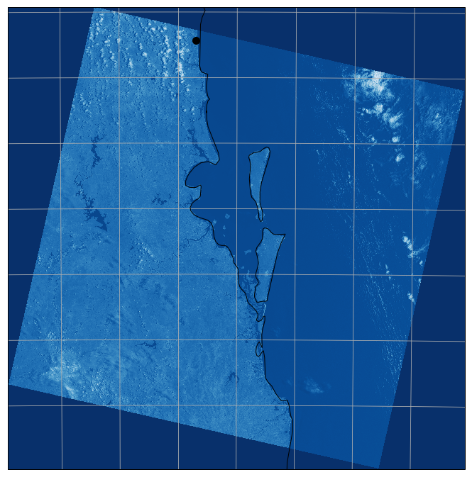
Displaying the first image
First, we read the image data.
    # read the image into a data array
    data = ds.ReadAsArray()
To display our first image, we work out how big it is, size an Axes object to that size, show the image, and add some example map content (coastlines, location of home).
    #  create image projection
    zone = 56
    projection = ccrs.UTM(zone, southern_hemisphere=False)

    # create an Axes object with this projection
    subplot_kw = dict(projection=projection)
    fig, ax = plt.subplots(figsize=(12, 12), subplot_kw=subplot_kw)


    # set the extents of the Axes object to match the image
    # extent is x,y origin to x,y + pixel size in (x,y) direction * image size in (x,y) direction
    extent = (gt[0], gt[0] + ds.RasterXSize * gt[1],
              gt[3] + ds.RasterYSize * gt[5], gt[3])

    ax.set_extent(extent, projection)

    # show the image (specifying the image origin as being the top of the image),
    #   and using a blue color map
    img = ax.imshow(data, extent=extent,
                    origin='upper', cmap='Blues_r')

    # draw coastlines, and gridlines  (grid line labels not supported for hand crafted UTM projection)
    ax.coastlines(resolution='10m',zorder=4)
    ax.gridlines( draw_labels=False)

    #  plot a marker for home, just to how how lat/lon data can be superimposed
    ax.plot(153.09, -26.53, marker='o', markersize=10, color='black', transform=ccrs.Geodetic())

    plt.show()
One item to note is that Cartopy has only a small number of projections for which it is prepared to label gridlines, and UTM projections are not in that number. So we have to turn labels off to supress warning mesages.
This gives us the map below (the use of a Blue color map was an experiment that won't be repeated).
Zooming into the image
For our next map, we are going to zoom into a very much smaller area, and this time we will use a PlateCarree projection for the map, so that gridline labels can be used. This increases the run time, as the image has to be re-projected. We will also use gray-scale for the image.
    #  size in lon/lat on map area
    x0 = 153.03
    x1 = 153.12
    y0 = -26.605
    y1 = -26.515

    # set up projection constants

    # first the image projection
    zone = 56
    projection = ccrs.UTM(zone, southern_hemisphere=False)

    img_CRS = projection

    # now the plot (Axes) projection
    plot_CRS = ccrs.PlateCarree()

    # and finally the projection for lat/lon data
    geodetic_CRS = ccrs.Geodetic()


    # transform limits of plot to Axes units
    x0, y0 = plot_CRS.transform_point(x0, y0, geodetic_CRS)
    x1, y1 = plot_CRS.transform_point(x1, y1, geodetic_CRS)

    # create figure and axes  (the 0,0,1,1 specifies that we want the whole figure for the image)
    plt.figure(figsize=(12,8), dpi=100)
    ax = plt.axes([0,0,1,1], projection=plot_CRS)

    # compute the area covered by the image, and the Axes object
    extent_tif = (gt[0], gt[0] + ds.RasterXSize * gt[1],
              gt[3] + ds.RasterYSize * gt[5], gt[3])
    extent_map = (x0, x1, y0, y1)

    # set the map extent, using the Axes object projection
    ax.set_extent(extent_map, plot_CRS)

    # show the image, specifying its extent, and its projection.  We use gray scale
    img = ax.imshow(data, extent=extent_tif,transform = img_CRS,
                    origin='upper', cmap='gray')

    # add coastlines (pretty wrong), gridlines, and labels
    ax.coastlines(resolution='10m',zorder=4, color='navy')
    gl = ax.gridlines( draw_labels=True)
    # suppress gridline labels at top to allow space for title
    gl.xlabels_top = False

    # plot home (in Geodetic units)
    ax.plot(153.09, -26.53, marker='o', markersize=10, color='red', transform=ccrs.Geodetic())

    ax.set_title('LANDSAT Band 5 (Near IR), Projection: PlateCarree')

    plt.show()
This gives us this map:
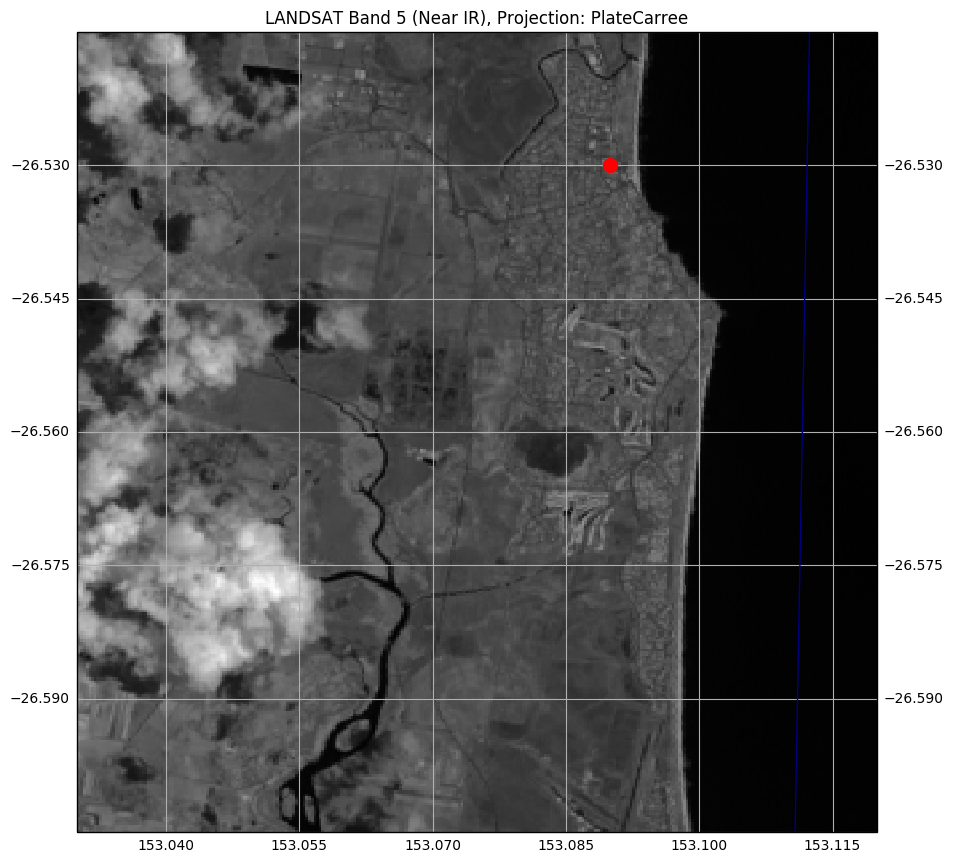
Even the '10m' coastlines are too coarse for this very much zoomed map. If you look in the two grid squares
below the square containing the red dot, you can make out the two golf courses
(fresh green grass reflecting strongly).
Conclusion
I'll wind this post up here. The next post will contain details on LANDSAT color images and mapping.
Just for completeness, here are the imports for all the code above (and some code to come) (some are used only to support print-outs that define the environment for reproducibility purposes) :
    # all imports should go here

    import pandas as pd

    # most of these following are used to support repeatability of the notebook
    import sys
    import os
    import subprocess
    import datetime
    import platform
    import datetime
    import math

    import matplotlib.pyplot as plt

    # support for TIFF input
    import gdal
    import osr

    import cartopy.crs as ccrs
    import cartopy

    import numpy as np

    # used for color image processing
    import skimage.exposure
    import skimage.io as sio
The notebook that has all the code is coming soon.