Welcome to the Weeding Page
Introduction
I participate in dune and bushcare restoration activities, covering areas from Stumers Creek north of Coolum Beach south to Twin Waters/North Shore on the Maroochy River.
This page shows records of weeds seen, being scans of a weeding log-book I (briefly) maintained for a while.
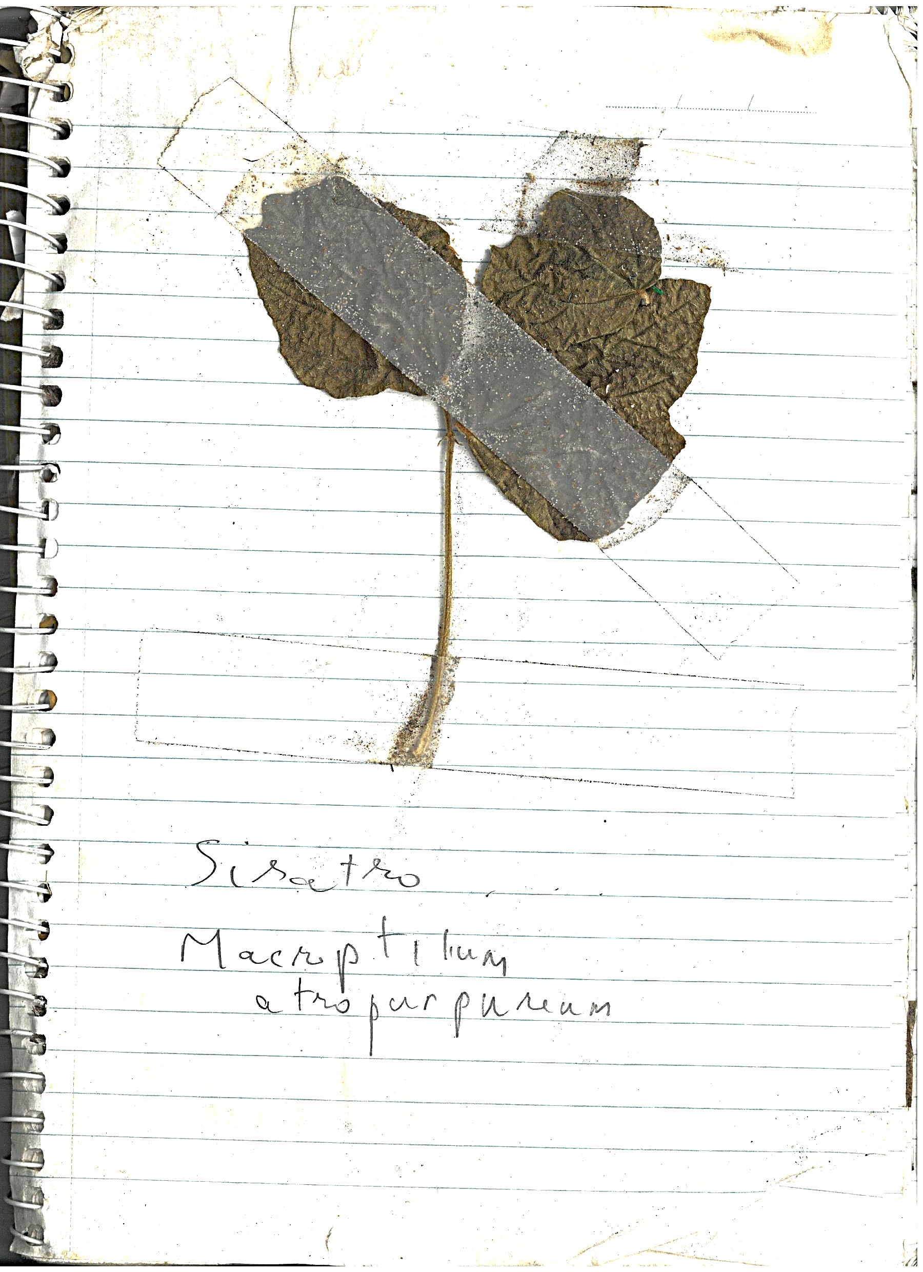
Siratro
"Siratro (Macroptilium atropurpureum)is a legume which is native to tropical America, and widely used in coastal eastern Queensland and coastal New South Wales as a pasture plant. Siratro is considered an environmental weed that smothers native plants, especially in south-eastern Queensland."
We pulled out Sirato early on my weeding career, along the banks of Stumers Creek (about the only open area suitable on my patch for this grass).
Log book page
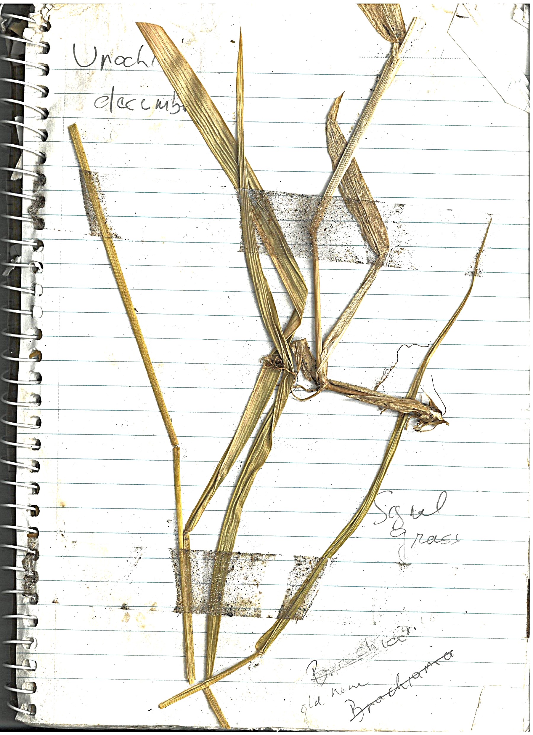
Signal Grass
"Urochloa, commonly known as signal grass, is a genus of plants in the grass family, native to tropical and subtropical regions of Eurasia, Africa, Australia, the Americas, and various island. Signal grass (Urochloa decumbens) is regarded as an environmental weed in south-eastern Queensland."
Initially, there were open areas that had Signal Grass growing, but as the upper canopy is providing more shade, we don't see it much. There is the occasional patch along walkways that get more sun.
Log book page
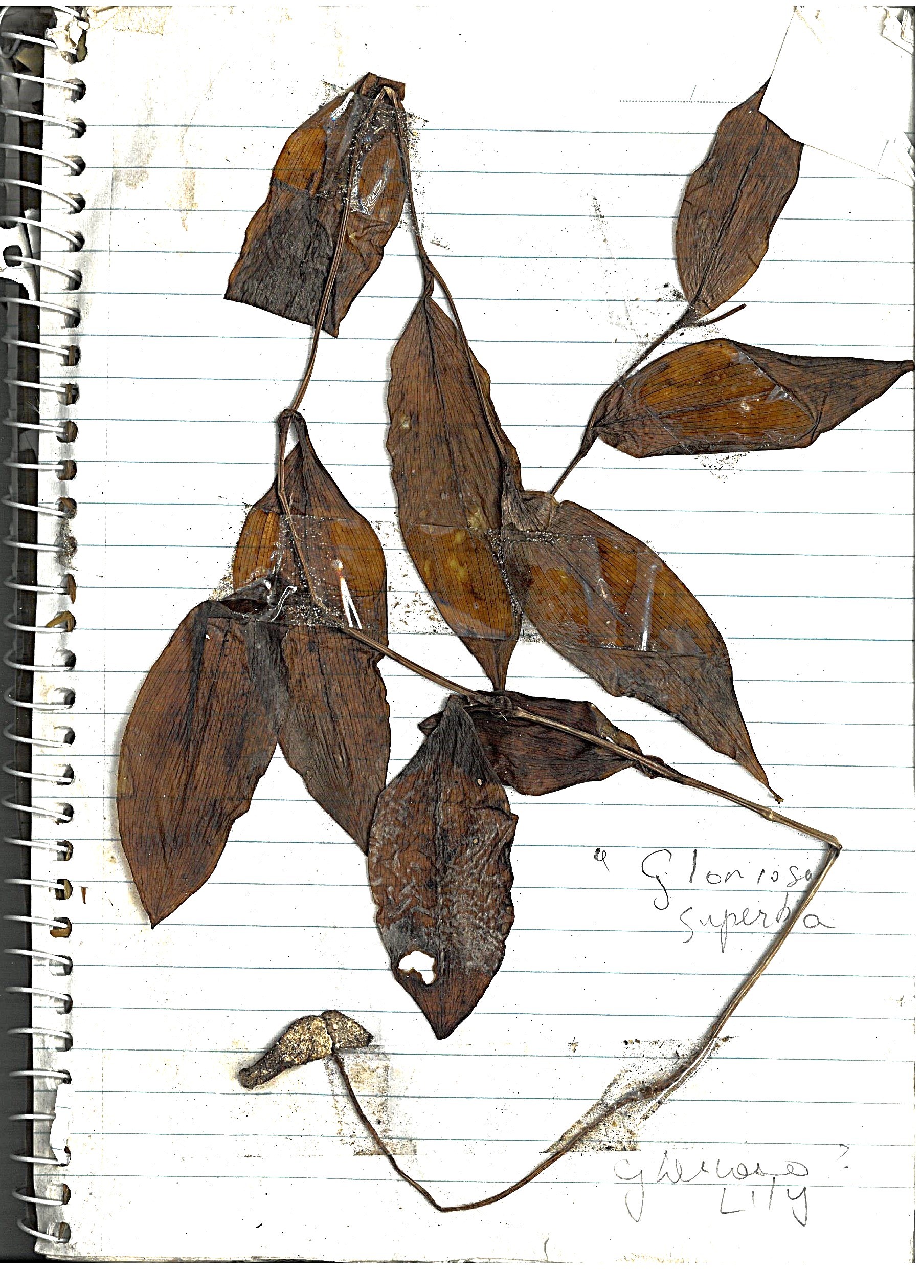
Glory Lilly
"Glory lily is a poisonous, climbing plant with red, orange, and yellow flowers. It is toxic to people and animals, and all parts are poisonous."
This plant is the one of the nastiest weeds, in that it is very hard to remove mechanically. It grows a very deep tap-root, with a tuber at the bottom. Pulling the plant up leave the tuber, which grows up again. We mostly just remove the surface growth (to prevent seeding), and I guess eventually the tuber will die.
Log book page
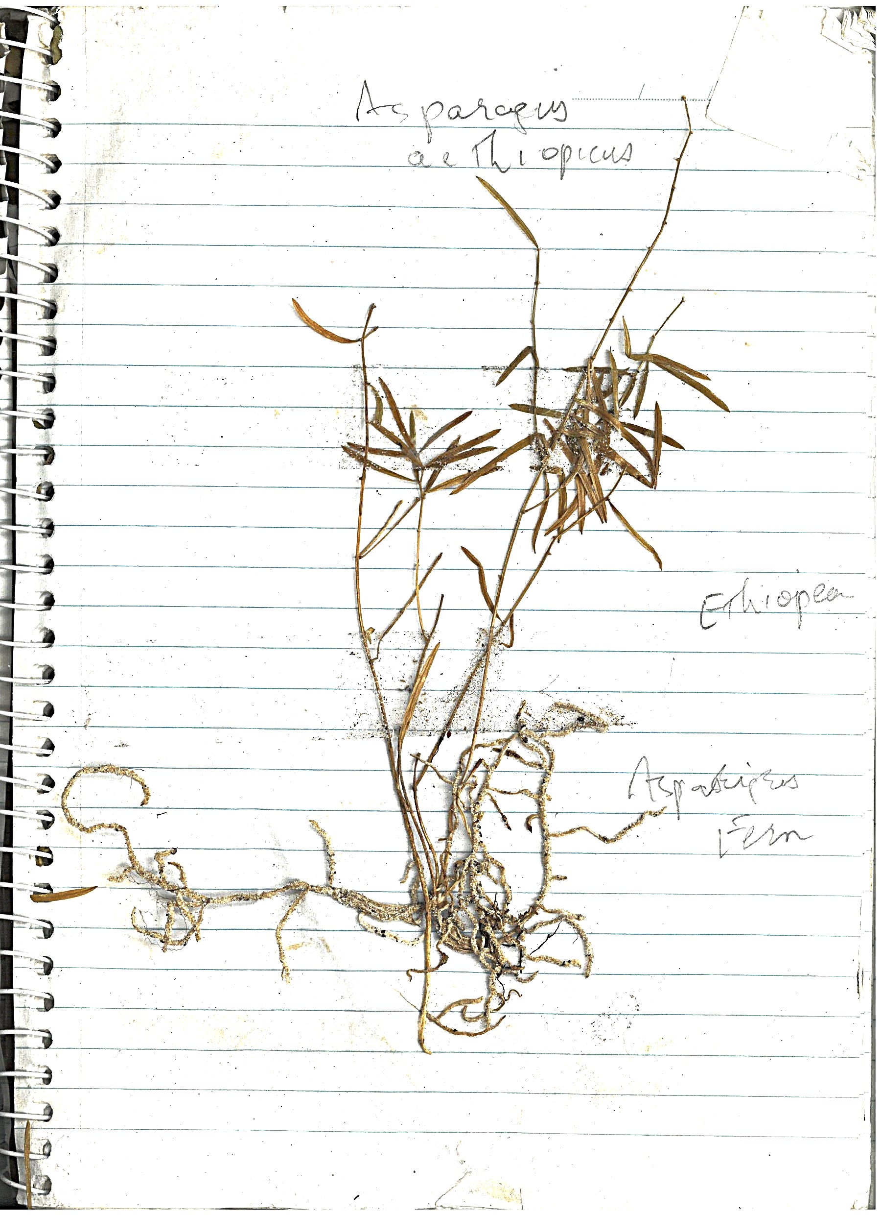
Asparagus Fern
"Asparagus aethiopicus is a branching perennial herb with tough green aerial stems which are sparsely covered with spines."
This so-called fern represents the bulk of our weeding effort currently. Left unattended, it can completely cover the landscape. Thankfully, it is susceptable to mechanical removal, as the plant grows from a shallow corm, that can be easily cut or dug out (which is good, because complete removal of a mature weed mat would be very disruptive to surrounding plants).
Log book page
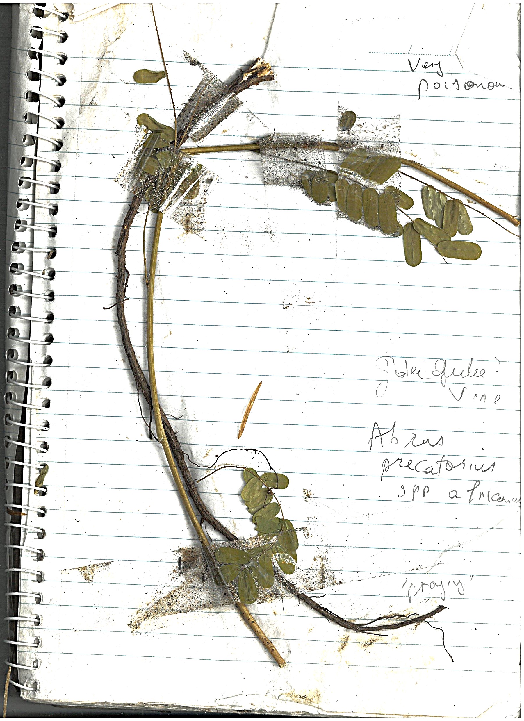
Gidji Gidji Vine
"Gidgee Gidgee (Abrus precatorius) is a slender climbing plant with shiny, bright red seeds with a black spot. The seeds are poisonous if chewed and swallowed"
This vine can be a weeder's heart-breaker. It grows up into the canopy (metres out of reach), where it develops seed pods with large numbers of small red seeds, just waiting to burst and scatter seeds over a large area. The seeds can remain viable for at least a few years, so even after removing all vines, you have to come back regularly to remove new seedlings. Thankfully, even though small seedlings quickly develop a deep tap root, they can be pulled out by hand, if you get to them early enough.
Log book page
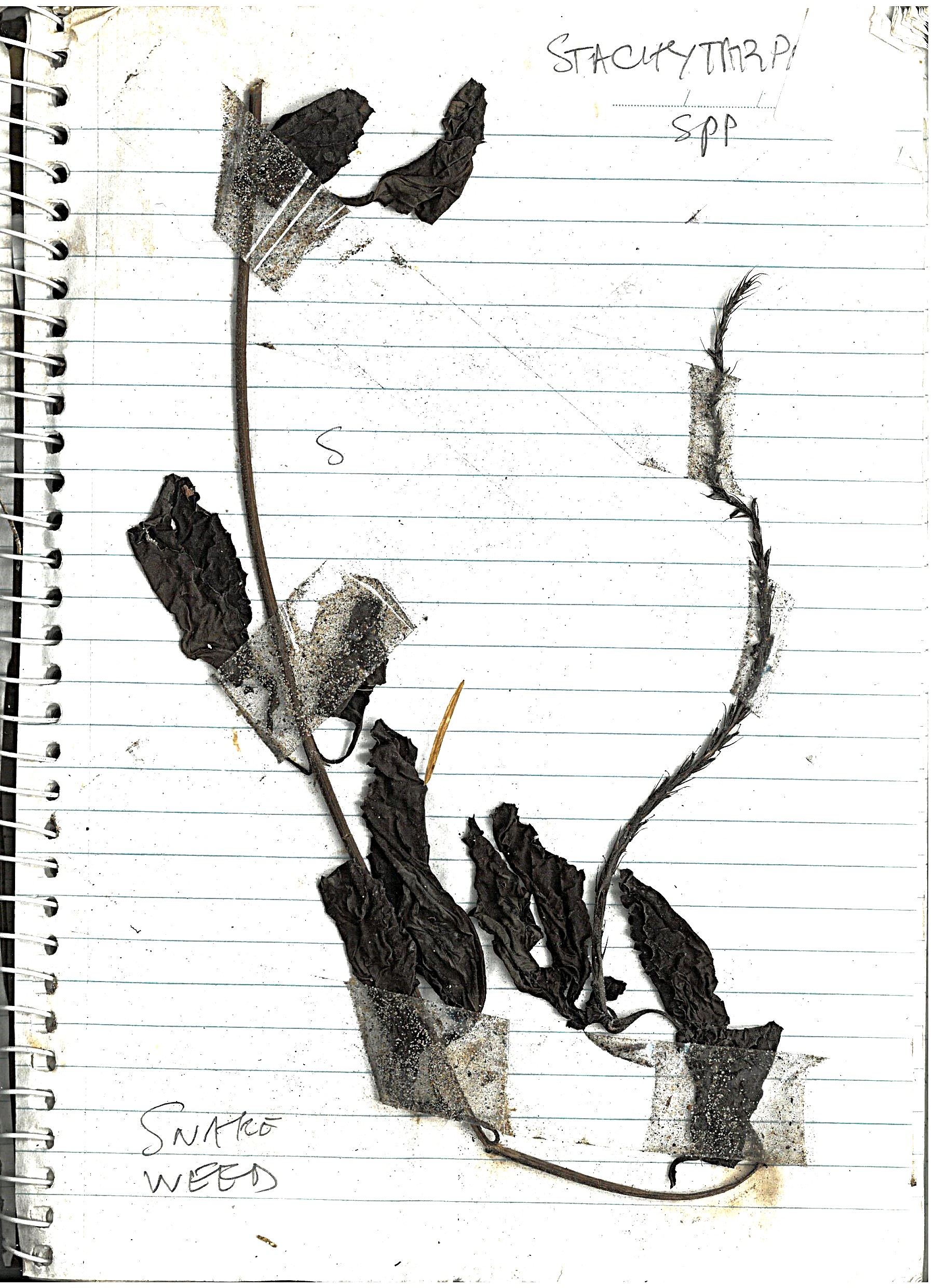
Snake Weed
"Snakeweed (Stachytarpheta spp.) is an invasive plant in Queensland"
Although this is in my weeding log, I can't remember where and when I pulled this one out. Shows the importance of an improved weeding log, with dates and locations.
Log book page
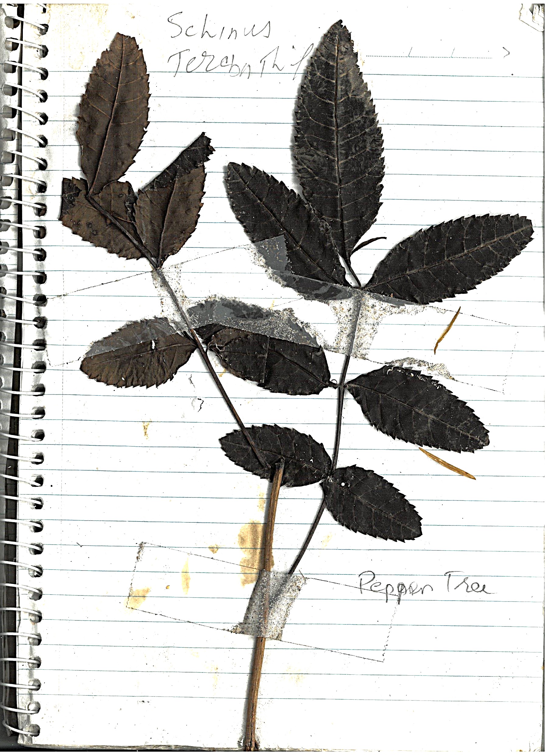
Pepper Tree
"Native to South America, broad-leaved pepper tree is a large, spreading tree. In Australia, it has escaped gardens and invaded coastal dune lands, wetlands and streambanks."
Mostly we poison these trees, as they grow quite large, and are difficult to remove mechanically.
Log book page
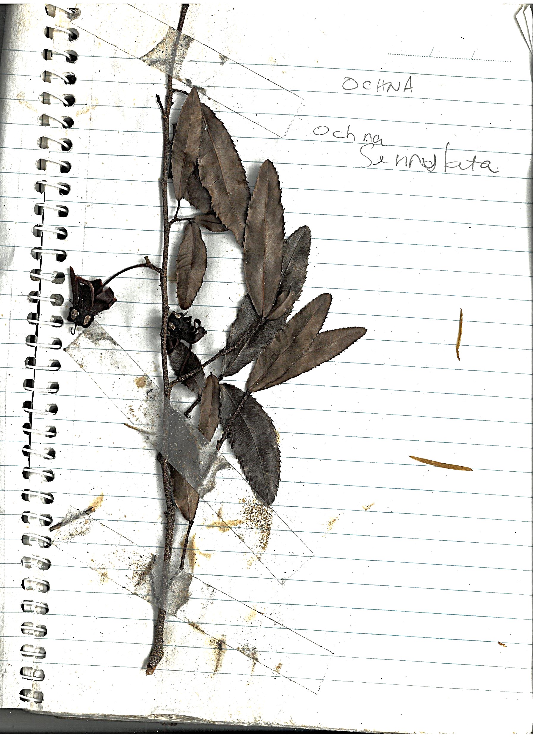
Ochna
"Ochna (Ochna serrulata) is a significant environmental weed in Queensland "
Another weed we use poison on, as their root system is hard to remove by just pulling them out by hand, once they pass the very small seedling stage. This one is quiet common, and easy to spot because of its serrated leaves.
Log book page
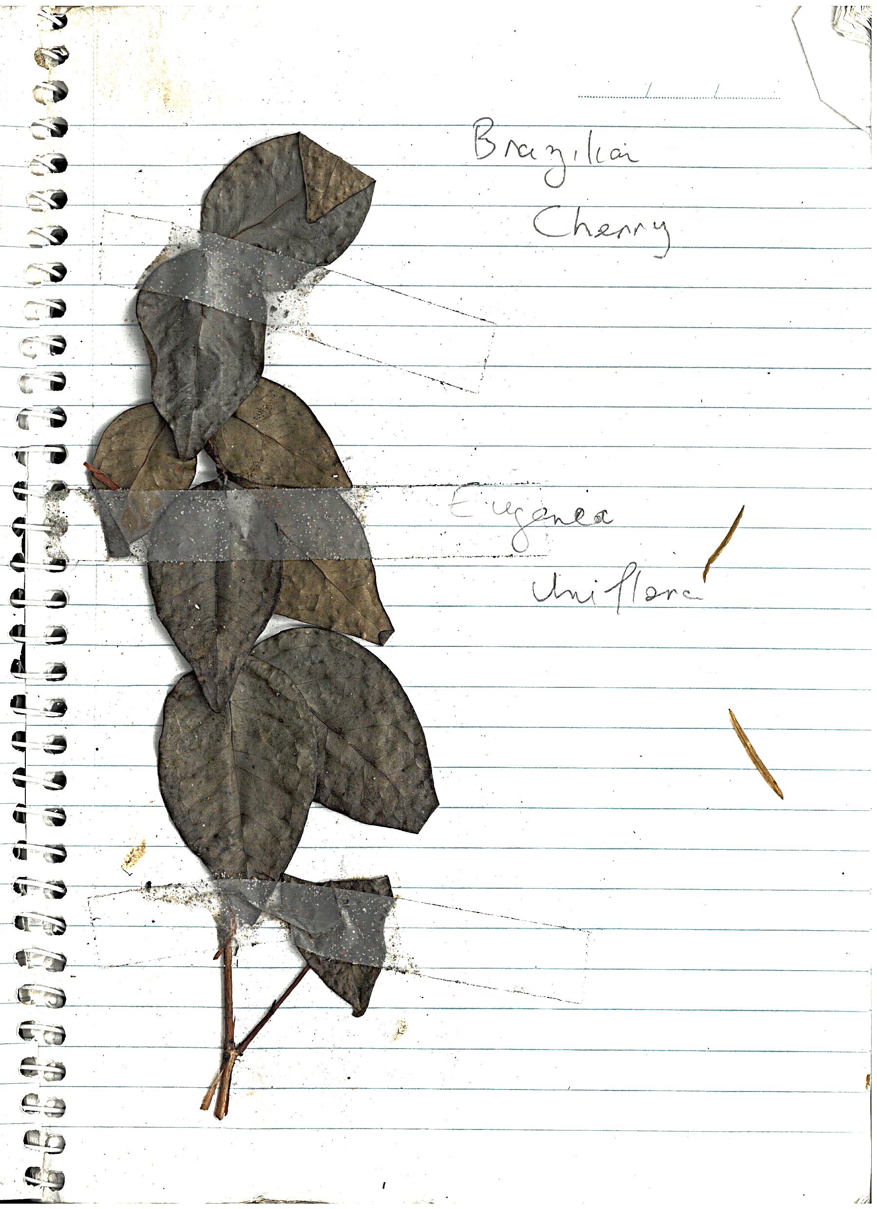
Brazilian Cherry
"Brazilian cherry (Eugenia uniflora) is regarded as a relatively important environmental weed in south-eastern Queensland, where it appears on the list of the top 200 environmental weeds."
Again, another weed we use poison on, as their root system is hard to remove by just pulling them out by hand.
Log book page
More to come!
I found this weeding log at the bottom of my weeding tool-bag, and decided to put it on the Internet.
I had teased a friend of mine who has started to grow cactus as a hobby - "I expect to see a web-page with photos of each individual plant, and Latin names". So I thought I would be the change I wanted to see in the world (people documenting their hobbies in a longer form than Twitter / Bluesky allows).
There are many weeds missing from this list, including Corky Passion, Lantana, Mother of Millions, etc. Our patch is (thankfully) remote from ornamental gardens and gardeners, so people dumping cuttings in our bushland is not a major source of weeds. I have been inspired to update the weeding log, so watch this space for more!